 |
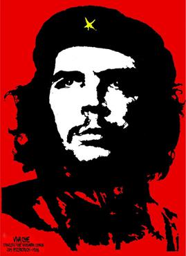
| Jim Fitzpatrick's iconic poster of Che Guevara |
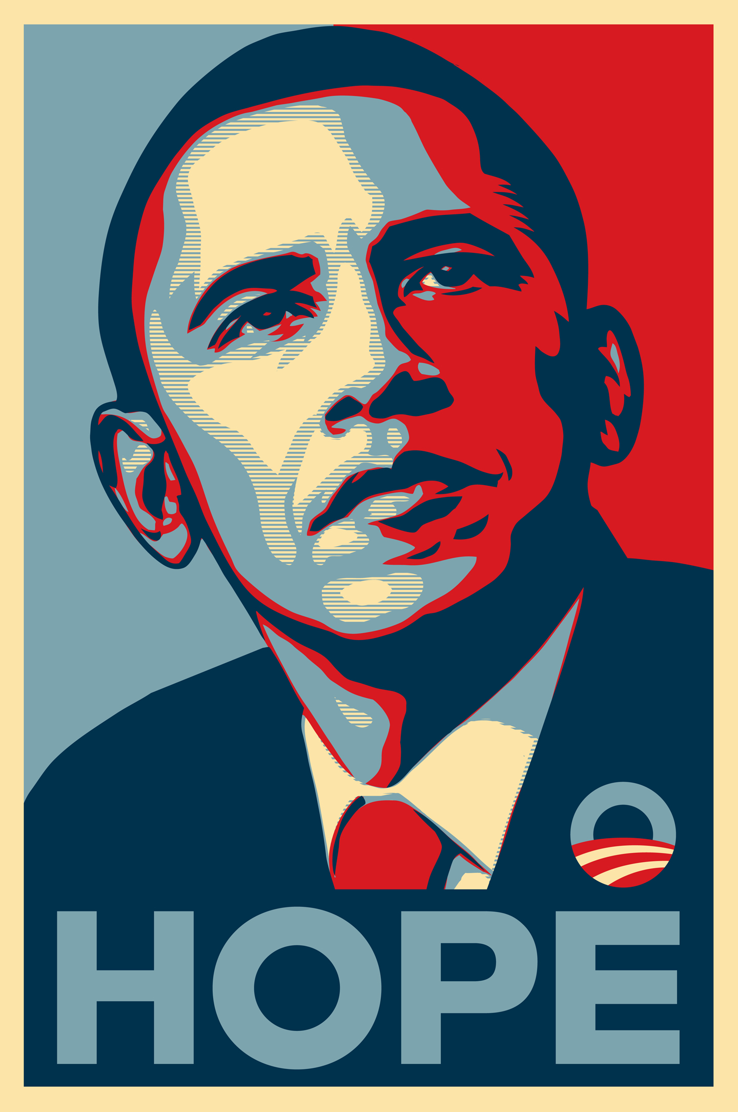 |
| Shepard Fairey designed Obama presidential poster |
The style of the Obama poster would work well for the front cover of the album due to its political connotations and iconic style. When looking at my version, the audience would immediately be able to identify the idea behind the poster, as it is heavily connected to politics, particularly the American Government. This works in my favour due to the nature of the track and the referencing of President Carter's speech, as well as the style of the music video; politics and social equality are intrinsically linked. The use of colour is extremely bold, which makes the poster eye catching. This is a desirable trait when designing and producing an album cover/poster because capturing audiences attention is the primary aim of advertising and marketing. Furthermore, the poster acts as propaganda, again fitting with the themes of the music video and the track; propaganda is a form of communication aimed towards influencing the attitude of the community toward some cause or petition by only representing one side of the argument. The album covers and poster could act as propaganda, only it will be propaganda used to raise issues regarding social equality.
If I were to use the style of the poster I would simply Photoshop one of my own photographs in a similar style, making sure that my version would alter from the original in order to conjure a sense of originality and creativity in my own work. Additionally, I could replace the word 'hope' for the bands name 'Fold' in order to promote the band, adding the album name below the main text. When considering this idea, I realised that if I used this technique on the front cover I would have to replicate the effect, or a similar effect, across the rest of the album. Using this sort of stencil style across the album would most probably be slightly overpowering to look at, thus the Obama style poster would only work for one panel. Considering this, I may use the idea for the magazine advert/poster as the original design worked as a poster; therefore my version could also be used effectively as a poster. This would also allow me to use a theme for the album covers that works more as a series rather than one individual image.

The original Obama poster has been subject to many imitations and parodies, including the poster that Fairey himself altered in order to offer his support to the Occupy Wall Street campaign and the We Are The 99%. This version (above) features the Guy Fawkes mask that has become widely renown amongst political protest groups, in particular the group of hackers who go by the name 'Anonymous', as well as alterations to the presidents badge to bear the slogans 'WE ARE THE 99%' and 'OCCUPY WALL ST.'. Furthermore, this version also added a line of text, saying 'we are the' in addition to the original 'hope'. This adaptation to the poster is a further asset to my print production due to the fact that it endorses the fight against social inequality, the same issue that we hope to raise and challenge in the music video. Additionally, I noted the 'Anonymous' group and the film "V For Vendetta" as intertextual references for the music video, and so the poster is an extension of these references. The 'We Are The 99%' slogan is another aspect that we had hoped to capture in the music video, with one side of the splitscreen representing the 99% and the other representing the richest 1%. I had also considered including these figures in my print production to further increase the idea of binary opposition/conflict between social classes. If I decide to use the Obama poster idea, hopefully the audience will also be able to make the connection, and identify with, the adaptation for the 'Occupy Wall St.' campaign as it would be beneficial to the advertising and marketing of the album, as well as successfully conveying meaning.

I would use either of these images in Photoshop to achieve the Obama poster style, however, I feel that the photograph of the businessman character would be most successful as it has more colour to provide contrast. Furthermore, the 1% (of which the businessman character represents) is the target for the rest of society in terms of social inequality, and so it would make more sense to use this photograph on the front cover rather than the image of the protester character. Additionally, either photograph would be easy to use in Photoshop as the background is relatively easy to remove and both are well lit and from similar distances.


These are some possible font ideas for use on the print production, with a possible name for the album title. I've chosen to look at reasonably bold and American looking fonts in order to fit in with the theme of the track and music video. The bolder and hard edged fonts with easy readability work best for the album cover, as the audience will be able to understand the text quickly and the text itself will be eye catching.
Your design idea is splendidly researched and discussed. As you say 4 panels using the bold design of the Obama poster and its imitators may lose impact.
ReplyDelete