It is important to note the target audience of the music video, this being primarily 18-25 year old white British males who are well educated. This is due to the mature subject of the music video and track, which would be unlikely to appeal to a younger target audience. This particular target demographic may explain some of the choices made in regard to using, developing and challenging generic conventions of music videos. The target audience is primarily male due to the use of a male actor, thus it could be interpreted that the video supports the marginalisation women in the music industry. Furthermore, a part of the target demographic that the music video is aiming for is political protest groups, as these are predominantly made up of white British males who are well educated or are still in further education. For example, during the protests regarding university fees rising, many students who were to be going to university came together in order to make a stand against the government from making cuts in education resulting in rising fees, making it harder for some to get access to universities.
 Gunther Kress defines genre as "A kind of text that derives its form from the structure of a (frequently repeated) social occasion, with its characteristic participants and their purposes". In regard to this theory, the music video indeed uses generic conventions in order to enable the audience to identify with the montage narrative, characters and locations. For example, white British males are often associated with being in power (most of the British Government consists of white men, 22% of British MP's are female) and so the audience are able to see immediately that by using the white male in the suit that he is a connotation of power and wealth. This is an example of a ‘frequently repeated social occasion, with its characteristic participants’ as the generic conventions are what an audience would expect to see from a political genre.
Location
 Due to the political nature of the track, the music video both uses and challenges the generic locations for a music video based upon equality within society. When thinking of locations to represent the 1% side of the splitscreen, I began to think of areas that were well developed and had evidently received large amounts of money in order to be developed. These sorts of locations would also be fitting with the track, as the speech is political and references inflation, recession, self indulgence and consumption of material goods. Norwich doesn’t generally have many large buildings, such as glass front banks and stock exchange buildings. Therefore, we made the conscious decision to film in London, particularly in areas such as the docklands (containing Canary Wharf and the J.P Morgan building) and the American Embassy. These locations are to be considered somewhat generic in relation to the track, its lyrics and the genre and so with these locations I used generic conventions in order to provide a location familiar to audiences. Furthermore, by using well known areas such as the American Embassy and the London Underground, the target audience for the music video would be able to quickly identify with the production due to the recognizable locations; the American Embassy would appeal in particular to the white British protest groups as many protests have been staged outside of the building over the years. For example, in 1968 up to 10,000 people gathered outside of the Embassy in order to protest against the war in Vietnam, with the public stand taking a violent turn resulting in more than 200 people arrested and 86 injured.
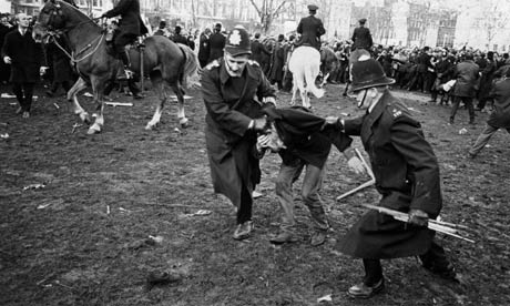 |
| Anti-war protest in Grosvenor Square, 1968 |


 |
| Gordon Gekko in his Wall Street office |
 |
| Low angle shot of skyscraper in the opening of the music video for "Afrika Shox" |
Alternatively, when looking at these heavily formal and business like locations it could be interpreted that the locations actually challenge the generic conventions of glamourous mainstream music video locations. Certain genres of music videos tend to have generic locations; rock music videos often use dark locations or actual footage of the band performing on a stage, pop and hip hop videos often use locations such as nightclubs and local neighbourhoods. For example, the video for The Rolling Stones track “Start Me Up” is composed almost entirely of the band performing to the camera on a simple stage set up. Another example is the music video for “Stand Up” by the Rap artist Ludacris, in which the location for the music video is mostly shot in a club. From looking at these locations as generic conventions, it becomes apparent that the business district locations used in the music video could be seen as making a political point through the depiction of contemporary Britain.
 |
| Screen shot from "Stand Up" by Ludacris showing the club location |
 The locations used to represent the 99% are unconventional in comparison to glamourous locations used for mainstream genre music videos; instead these contemporary images of Britain are used to make a political point, with each location picked due to its political resonances. However, when compared to locations seen in trip hop music videos, the locations in our music video become somewhat less generic. The locations used in trip hop music videos seem to create more of a surreal and atmospheric mise en scene, taking the audience away from reality in to a realm of heightened reality. For example, the music video for "Karmacoma" by Massive Attack (arguably one of the most important groups in trip hop) uses a range of locations within a hotel in tandem with highly saturated colours and swooping camera shots in order to assemble a montage of peculiar events. In the video for "Angel" by the same group, the location is a dingy and gritty car park; both of these locations seem to aim to create a sense of unease amongst the audience, evidencing that we chose the locations in our music video for entirely different reasons - to represent a social group. However, some of the scenes shot on the street in the music video are similar to those seen in other trip hop music videos, such as "Midnight in a Perfect World" which represents a more down to earth approach than the Massive Attack videos. Trip hop is a widespread genre with a large number of influences and so conventions seen in one video may be different to another, unlike pop music in which conventions are frequently repeated (Kress) until they become generic. Therefore, the locations in the music video, when compared to mainstream genres, are less generic and so challenge generic conventions of locations.


Costume

The choice of costume in the music video was based upon two objectives; representation of the characters and their back stories, and to create further binary opposition between the two sides of the split screen. The costume for the protester character was based largely around what the majority of young people in society wear on a casual basis, particularly those in middle and lower classes. This meant dressing the character in a plain white t-shirt, jeans and trainers to demonstrate the lack of exuberant wealth that this characters social class has to spend on material goods such as clothing. These plain clothes don't carry the same status as the clothes of the businessman character. An important point of dressing this character in regular clothes that wouldn't stand out amongst others in society is to create the idea of a blank category (Giroux) that the audience can use to identify with as though the character is themselves. This allows the audience to be able to empathise and identify with the protester character, as they will be in similar positions. The chose the colour of the t-shirt based on how it would contrast against the black of the businessman's suit, as well as the connotations surrounding the colour white. White is associated with innocence, goodness and purity which symbolises the position of the 99% as they aren't the individuals corrupting the economy. In other words, the 99% have to face the results of decisions made by the 1%. The costume of the protester could be considered reasonably generic as we based it upon clothing that is worn by a large proportion of young people in society; this evidence was gathered by the fact that we have an awareness of current trends amongst young adults seeing as it is our demographic. Therefore, the protester character uses generic conventions in costume in order to allow the audience to identify with the character easily. The casual clothing worn by the protester character represents the casual everyday street wear worn by many. For example, similar types of casual clothing can be seen on the male characters in "Be There" by UNKLE as they are all supposedly from the middle and lower classes. Another example is the animated character 2D from the Gorillaz music video for "Clint Eastwood" as he is wearing a white shirt and jeans; although the character is animated in the video, the generic characteristic of costume remains the same.
 The costume of the businessman character also uses rather than challenges generic conventions due to the popularity of the black suit amongst music and film. The black suit is an iconic costume due to its replication in films such as "Pulp Fiction" to "The Maltese Falcon", making the suit a common costume due to the main characters donning suits. The suit serves a similar purpose to the ordinary clothes of the protester; the black suit is common and so the character loses his individuality and becomes an empty or blank category that the audience can use to portray their visual depiction of the 1%. In a way, it is not so much about the character himself, but rather what the suit represents and connotes. The black suit in this case shows the power and authority that the businessman character has within society, demanding respect from others and showing the status of the wearer in the class system. The colour black is also the binary opposite of the white of the protesters shirt, creating further conflict between the two characters. Black carries negative connotations and is associated with power, formality, death and evil. Furthermore, black is associated with fear and unknown, denoting strength and authority; all of these characteristics associated with the colour fit the generic stereotype of the businessman character and the connotations that the suit carries. Characters dressed in black suits already have a number of connotations, however, by using the costume in the music video we have developed the genre convention by adding to the symbolism of the suit by representing a social class and all of the corruption, power, wealth and fear that goes along with it.
 |
| Al Pacino in "The Godfather Part 2" wearing a black 3-piece suit, showing black suits as a convention amongst traditional gangster representations. |
 |
| Gordon Gekko (Michael Douglas) shown wearing a black suit, similar to that worn by the businessman. This shows a strong link to the generic costume and the corrupted characters that wear them. |
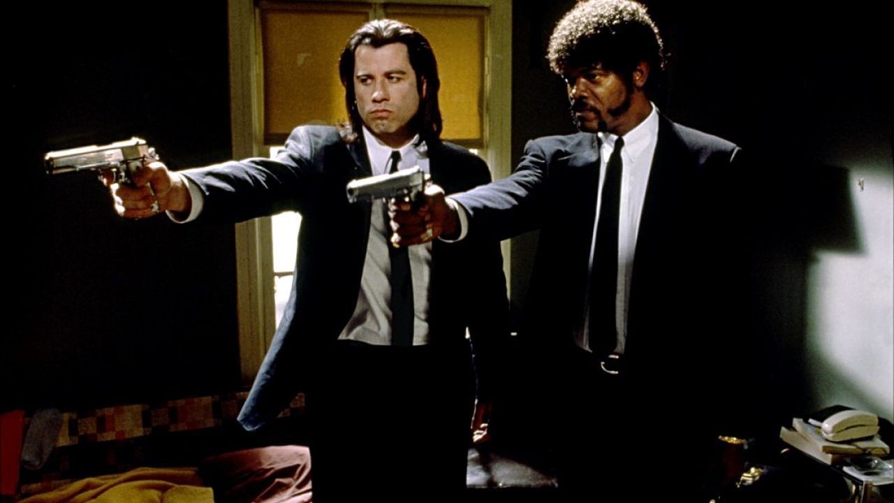 |
| Black suits as worn by two of the main characters (who happen to be hitmen) in "Pulp Fiction" |
Narrative Structure/Editing
The music video challenges genre conventions on another level, as many music videos use performance or a dance routine to provide the body of footage for a music video. Trip hop videos often cross over narrative with performance, creating a story whilst also having band members singing to the camera. An example of a music video that is mainly performance/dance routine would be "Islands" by The xx, with the video depicting symmetrical dance routines and the artists performing the track. An example in which the music video uses both narrative and performance would be "Angel" by Massive Attack (video posted above) as the film creates a strong sense of linear story telling, as well as weaving in elements of performance with some band members mouthing the words of the track and some acting in the video itself. Performance and narrative have both become generic conventions of music videos as they have been repeated a number of times, corresponding to Abercrombie's theory that 'genres permit the creation and maintenance of a loyal audience which becomes used to seeing programmes within a genre'. Therefore the strong sense of story telling used in our music video would either be using or developing on the generic conventions of music videos as it uses narrative only, as many other music videos choose to do also, such as the music video for "War With Heaven" by Louis M^tters.
The music video for "Mr President, We're in Trouble" doesn't focus solely on one type of narrative structure, but instead mixes two styles. The story telling element is in a linear narrative, following both characters as they live a day in their lives, from when they wake up until they meet each other in the final shot; this is a linear narrative if viewed chronologically. Despite this, we haven't used match on action all the way through the video, instead using jump cuts to move forward in time quickly, thus the overall style of the video would be a montage with a narrative, rather than random events like a generic montage. Montage is the technique of editing in which contrasting shots or sequences are used to effect emotional or intellectual responses and relies on the symbolic association of ideas between shots rather than association of simple physical action for its continuity. Montage style is often edited to the beat and we made a conscious effort to do so throughout the video, matching hard cuts with the percussion instruments used in the track in order to maintain a relationship between music and visuals. Montage, as described by Eistenstein, can be an alternative form of continuity editing, placing a number of frames together in order to create meaning. Therefore, the montage style of our music video uses the generic conventions of montage narrative style, by creating meaning through a series of images cut to the beat. A similar style montage can be seen in one of the scenes of the TV series "Breaking Bad" in which the characters are shown cooking crystal meth; images are matched to the music but don't necessarily follow a specific order, however, the montage still conveys meaning to the audience.
Another generic convention that we utilised at several points in the music video is time-lapse; "Time-lapse photography is a technique whereby the frequency at which film frames are captured (the frame rate) is much lower than that used to view the sequence. When played at normal speed, time appears to be moving faster and thus lapsing." (Wikipedia) We used time-lapse for the shots of the characters in the underground in order to increase the amount of perceived activity around the two still characters as well as the shots of the buildings. This is a fairly generic technique as it is used commonly throughout music videos due to its aesthetically pleasing nature and way of making basic actions look more interesting. An example of a music video within a similar genre to the track we used that also utilises time lapse techniques is "Zero Dark Thirty" by the artist Aesop Rock; the time lapse in this video works within the confines of the montage narrative structure. We shot the footage for our time lapse in two different underground stations, hoping that the simplicity of the mise en scene would help to create a strong binary opposition between the two sides of the split screen.


One of the main theories that we aimed to incorporate into the music video was that of Claude Levi Strauss. He maintained that "constant creation of conflict/opposition drives narrative", relying on binary opposites to create this conflict. Binary opposites can be visual (light/dark) or conceptual (love/hate) and aim to create a strong sense of contrast between the two opposites. With this in mind, we decided to use a split screen technique for the music video so we could create a physical line between the two representations of society. In doing so, each side of the split screen represents the binary opposite of the other. For example, when the businessman throws his Starbucks cup on the floor - showing his consumerist nature - the protester is shown on the other side picking up the cup, acting as a visual metaphor for the 99% dealing with the actions of the 1% whilst also creating a strong sense of opposition to drive the narrative forward. To reinforce the sense of opposition between the two sides of the split screen, we used colour grading techniques in order to increase the saturation of colour on the side representing the 99% to show a brighter outlook and decreased the saturation (as well as adding a green hue) to the side representing the 1% to show misery. Additionally, when shooting the music video we made a conscious effort to set up a similar mise en scene in some shots to make the conflict a lot more obvious, with both characters perhaps sharing a similar or the same location, but in different ways. For example, we used Starbucks to show the businessman alone and compared that to the protester who was there with friends, demonstrating that consumerism and material goods don't always provide happiness.


When considering Barthes codes, we decided to opt for a closed text in which the meaning was explicit. This is important for the music video due to the message about society that it is aiming to convey; if the production was too open to interpretation then the meaning of the narrative would become lost and the message regarding social equality wouldn't be as strong. This challenges the generic conventions of trip hop music videos, as they are often very open in order to provoke the audience to question what they are seeing as well as their own perceptions; therefore the audience are left to decide what the meaning is behind the text for themselves. Two examples that share a very similar ending are the videos for "Burn My Shadow" by UNKLE and "Afrika Shox" by Leftfield. Both videos do have a closed ending in a way, however, much of the narrative is unexplained and the unusual circumstances of the videos lead the audience to question how the characters came to be in their situations, leading to an open text in which the audience fill in the gaps in the narrative that the video intentionally leaves.
 As part of the narrative, we decided to incorporate some of the elements of Goodwin's theory, with one point in particular being 'there is a relationship between lyrics and visuals'. We took into consideration the lyrics of the track and then shot some scenes that corresponded to those lyrics or themes, such as consumerism, self-indulgence and human identity. Matching lyrics with visuals is a well-used generic convention within music videos, as it is a way of amplifying or illustrating the meaning of the lyrics so that they become more explicitly obvious to the audience. It can also be done to contradict the lyrics or the visuals to add to the feeling of conflict or binary opposition in a music video. The music video for "Breezeblocks" by Alt-J (∆) is a perfect example of where visuals are used to illustrate and amplify the lyrics, as shown when I analysed the video in the Goodwin's theory case study. There are several explicit parts in the track where the lyrics are transferred to visuals on screen, such as "she may contain the urge to run away but hold her down with soggy clothes and breeze blocks" and this is matched with a shot of a girl underwater in a bath tub being weighed down with a breeze block. We aimed to keep this generic convention in mind whilst shooting for the music video to illustrate and amplify the lyrics, thus ensuring that the audience is able to receive the message of social inequality. For example, during the lyrics "Too many of us now tend to worship self indulgence and consumption. Human identity is no longer defined by what one does but by what one owns" we chose to use a sequence in which the two characters encounter a homeless man; the protester gives the man money and the businessman simply looks at the homeless man before walking off, signifying that the 1% 'worship self-indulgence' and care only about themselves.
Representation
The idea of using split screen corresponds to the theory of Jacques Lacan, who developed the mirror theory as a way of describing dual personality. This fits with one of the themes of the music video, as we chose to use the same actor for both sides of the split screen in order to represent two different paths this could be seen as a version of dual personality. The mirror stage describes the formation of the ego via the process of objectification, the ego being the result of a conflict between one's perceived visual appearance and one's emotional experience. This identification is what Lacan called alienation. In the music video we aimed to show the businessman character, representing the 1%, to be the egotistical character that actually feels alienated despite having the material possessions and power. This is the binary opposite of the protester, who doesn't have the same consumerist nature, but is instead happier in general. Lacan's mirror theory is explicitly referenced in the music video during the last two shots, in which the characters are first reflected in large mirrors before looking into the mirrors themselves in order to view the alternate version of each character. This displays the realisation from both the characters as they view the alternate versions of one another, representing the split personality element of Lacan's theory.


Our music video doesn't really challenge stereotypes of gender, as the main characters are both male due to being played by the same actor. This means that there isn't really a representation of women in the music video; this could be interpreted as inconsiderate as the generic convention is that men play the lead roles and dominate the screen time. However, it is also important to note that there is no representation of women in the music video because of the way we chose to shoot it - using the same actor created a more obvious conflict between social classes (social equality is the main issue, not gender in this case) and it was also more convenient in terms of organising, planning and shooting. The fact that the music video doesn't contain female characters could be seen as challenging Goodwin's theory of music videos in regard to the voyeuristic treatment of the female body, as this is a generic convention of many music videos. For example, the music video for "Blurred Lines" by Robin Thicke, Pharrell and T.I. objectifies women through the use of voyeuristic treatment of the female body; the women are half dressed in the clean version of the video and in the unrated version of the video the girls have their breasts on show. Representing women as sex objects, as this video does, gives a very negative stereotype and is in fact taking a step backward in fighting for gender equality. The representation of women in our music video is on neither side, as women simply aren't featured. However, including a female in the music video would have been interesting if we were aiming to tackle the issue of inequality between genders, particularly in politics.
 We chose to use a white British male as the businessman character in the video as it is embracing the stereotype of young white men being rich and in power. When looking at the members of parliament in the UK, almost all of the members are white men, with only a spattering of females and other ethnic groups present in the ratio to the white ethnic group. We decided to utilise this convention, meaning that the audience would immediately by able to identify that the character dressed in the suit is powerful and from a higher social class than the target demographic. This was achieved through the use of costume, the suit connoting power and status, as well as the use of low angle camera shots to give the character more stature and to create an intimidating look. This aesthetic of intimidation (also carried by the worms eye view of the J.P Morgan building) and power will be familiar to audiences who fear the government due to the power that they hold over the rest of society. White men are often associated with positions higher up in society, such as politicians, bankers and royalty which conforms to Laura Mulvey's theory of a dominant patriarchal society; when envisioning the government, much of the general population will think of a male as Britain has had only one female Prime Minister. It would have been interesting to perhaps try a female antagonist, however, the issue is primarily with rich white males and so this wouldn't have been as representative of the true problem.
 |
| Low angle of J.P Morgan building in London, representing the power and wealth of the 1% |


Another reason for choosing the actor to play both parts of the split screen was the fact that he appears older than his actual age, making it believable to be an up-and-coming businessman. Despite this, the audience may possibly still view the characters as youth and if so the representation of youth in the music would be on the whole a positive one. Youth is often represented in a negative light in the media, with films such as "Fish Tank" and "Harry Brown" showing youth to be destructive, violent and uneducated. These negative representations have become increasingly common, meaning that youth is almost always stereotyped in a negative fashion. If the characters in our music video were to be considered as 'youth' then the representations challenge the stereotypical depictions in contemporary and past media productions. This is because the businessman, despite being the antagonist of sorts, is obviously well educated, non-violent and is capable of having a good relationship with adult world. Furthermore, the protester character is also unlike the representations that have become so common in film and TV, being educated and fighting for a worthwhile cause in society, rather than being destructive to society. Therefore, the representations of youth in our music are positive representations that challenge generic stereotypes of youth in the media.
Britishness is successfully represented in our music video, with parts of it being shot in the capitol city of London, making it explicitly obvious. The representation of Britain is both positive and negative due to what the different sides of the split screen represent; one for the 99% and the other for the 1%. The 1% are to be represented negatively for the problems they create for the rest of society, thus it is a negative representation of Britain. The 99% are shown to be troubled, which adds to the negative stereotypes surrounding Britain, however, it also shows a positive representation as it acts as a visual metaphor for those trying to fight for equality within society. Symbolism of Britain is also explicit in the video, with a shot of the Union Jack flag opposite a flag from the protest footage, connoting the problems within the nation.

Print Productions
For my digipak, I chose to embrace the generic conventions of CD layout by using a 4 panel jewel case design. This means that the audience will be able to immediately identify what the product is due to its classic design, whereas some digipak designs harness more than 4 panels and thus don't provide that immediate impact. I decided to continue the themes of the music video throughout the print production design as to provide an encompassing product with a familiar appearance across all of the productions, with each panel/insert delivering a message. Furthermore, using a 4 panel design would be more considerate for an independent and unsigned band who will most likely not have the funds to mass-produce a lager digipak with more panels.
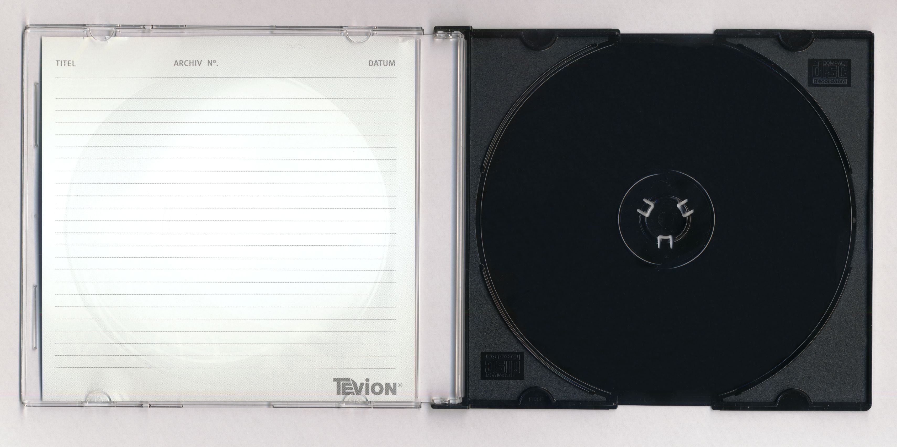 |
| Traditional 4 panel jewel CD case |
 |
| Front cover/panel 1 |
 |
| Portishead album cover showing a simple yet bold font |
 |
| Panel 3 and 4 |
 |
| Panel 4/back cover showing institutional information and a track listing |